/afaqs/media/agency_attachments/2025/10/06/2025-10-06t100254942z-2024-10-10t065829449z-afaqs_640x480-1-2025-10-06-15-32-58.png)

/afaqs/media/member_avatars/b19bc90752f22463c21493ea40ad04dd26b32ea4045d163717734c0181e00e52.png )
 Follow Us
/afaqs/media/post_attachments/a02ea15fdf71a0e156a4a0c40c9d513426af392900388eeef2fee1a46b449f94.jpeg)
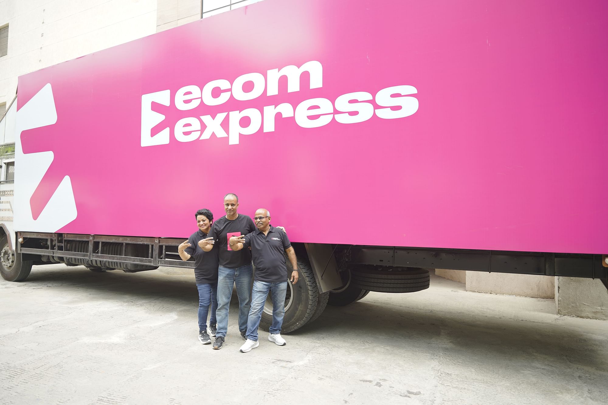
The new logo featuring a forward-moving arrow enclosed within a square, symbolising Ecom Express's commitment to progress and delivery.
Ecom Express Limited, a leading B2C e-commerce logistics solutions provider in India, has announced a rebranding initiative aimed at reinforcing its customer-focused approach. The company, recognised for its extensive pan-India express logistics network, introduced a new brand identity that encapsulates its dedication to addressing customer needs and integrating innovative technology.
/afaqs/media/post_attachments/f69890f161596973df199291f8c03d61cda5ee30749b2b70a45ea541f8ec1330.jpg)
The rebranding includes a refreshed logo featuring a forward-moving arrow enclosed within a square, symbolising Ecom Express's commitment to progress and delivery. The letter "E" within the logo represents Expression, Innovation, and Progress, while the bold magenta colour signifies bravery, self-expression, and strength.
/afaqs/media/post_attachments/7eb5b1d1c1f89238df44dcd06809fc07c96ac580568f20bc63df40f4c2d3c5d4.jpg)
Ajay Chitkara, CEO and MD of Ecom Express, highlighted the significance of this transformation: "Our refreshed brand identity signifies a reaffirmation of our customer-first approach. We are committed to integrating robust technology and innovation to deliver reliable, high-speed services with the widest network reach, all while optimising operational efficiency and flexibility."
The new identity reflects Ecom Express’s continued focus on enhancing customer welfare and promoting a diverse and inclusive environment, reinforcing the company's promise to simplify and democratise logistics across India.